
My Rough Guide
To Front-ends

I had a big article which covers all the front-ends out but due to a page error it all got wiped. So rather than give up. I will do it in pieces, giving you my opinion. I will cover everything front-end with pros and cons for everything about said front-end. I have used a fair few over the years and so without further adieu, I'm going to re-review my first excursion into proper immersion and I've already written about this in another article. But I may as well cover this in more detail so lets start with
First of 3d arcade between 2004 to 2009 was actually quite an experience because this community was quite vibrant with content creators and users alike. The engine was designed in Adobe Director (which is ancient now) by )p( who for the most part created it a Galaxian like front-end in which you shot the game you want to play however it evolved into 3D Arcade. )p( created a simple map of a circular room in which you put arcade in. The first official version of this front-end was released on an i-modernist website host on 24/4/2002 with version 0.6 its first arcade model released by Zakk (with a real media RM video file) in the w3d format (which ended up being the format to the arcade models for future releases), By this point there are a template of the base arcade model in which you could add a marquee and picture snaps. Its interesting how the early going on contributor was Zakk. But as the following versions, )p( went out of his way by adding a first person walking simulator (not FPS which is stated). but it wasn't until this 0.65 when this was implemented and )p( also added this point to everything is skinnable, let me rephrase that the first person part of the front-end had the ability to be skinned with anything you wanted (objects within the system) and this was still 2002. Personally I didn't join the community until 2003 when I built my first computer and a few months in i started looking for a front-end (with the advice of Jennatek) I found I liked this first because it represented something visual which wasn't a list format but I saw this as a screenshot
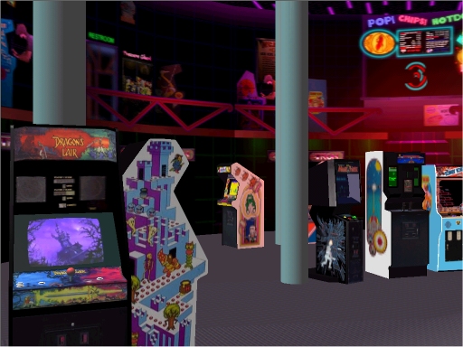
So with my 512k broadband modem (yes we have come a long way since those days). Then I discovered the major flaw in the plan. Configuration is different kettle of fish. While it looks good with the content, its' major let down is a serious learning curve in which you have to navigate the selset menu's which are not very well explained or well thought out. This is before youtube guides and the written guide is confusing at best (when you read for adding music is a playlist of playlists). While the learning the system takes a lot of time (in my case about 2 years when I came back to it). While the system has it flaws, The positives are (as the front-end is still available and works on windows 7) quite extensive with voodooscientist little cinema arcade which is a beautiful location ( I believe this was inspiration for NewRetroArcade:NEON). This is a good map because its' shows multiple different applications to use within a single map. While limited technology made it simple and cumbersome with things like delays between picture and sound, you got the gist of the experience. Another Map that was spacious and quite detailed was the exhibition hall. which showed a multi-level setup with some beautiful touches
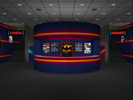
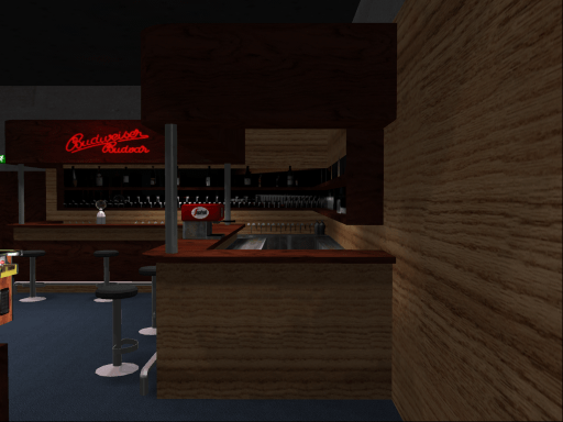
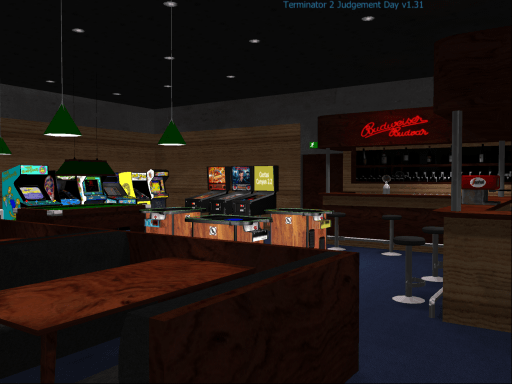
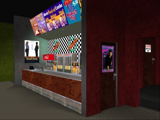
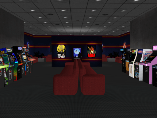
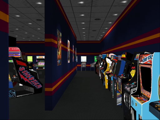
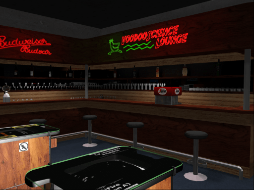
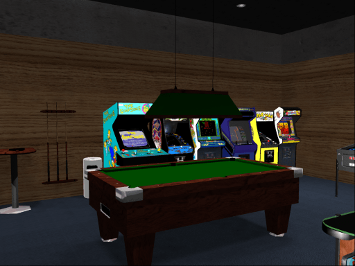
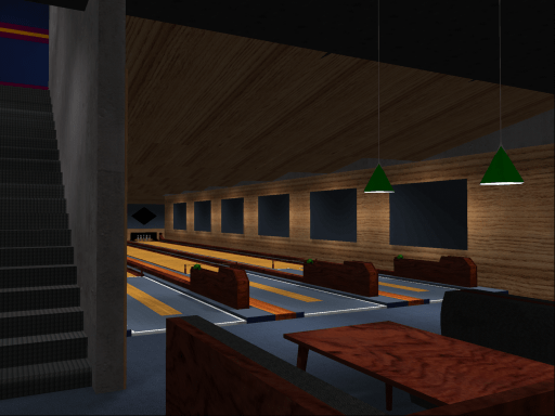

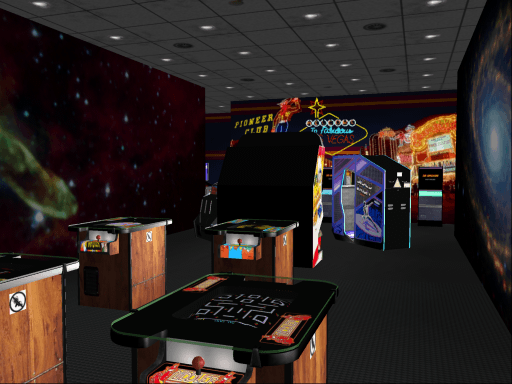
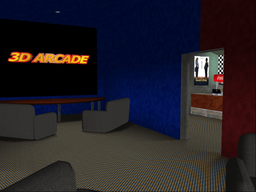
Pictures from VoodooScientist lounge. It features a home theater, A karaoke lounge, A bowling alley (non functional). I believe this was the inspiration for NewRetroArcade:Neon
The second arcade location
The Exhibition Hall
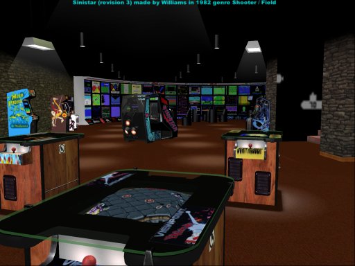
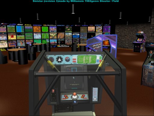
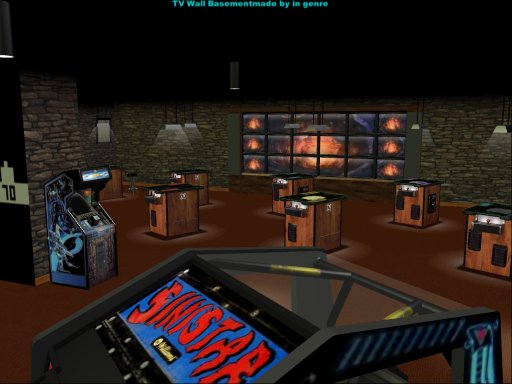
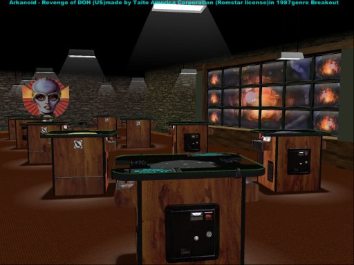
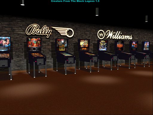
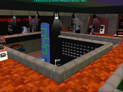
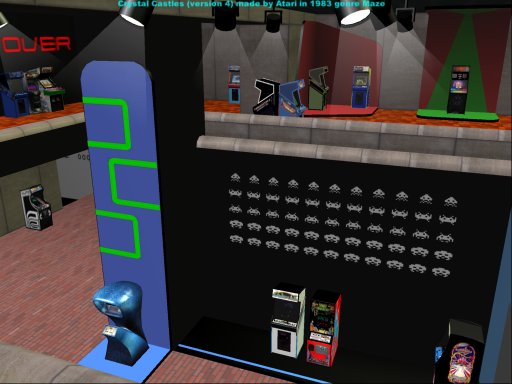
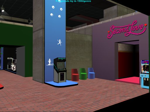
These 2 locations are what sold me, but this is where my first experiences were bad as configuring this thing is a challenge and during that time I wasn't a patient person during 2003/2004. I have gone back to this a few years later. I learned to put music within this thing (I thought that was a victory back then). But my second time returning to this was interesting because I learned a few things. By 2007 there was a DVD release which featured The front-end, artwork, maquee and arcade models and emulators (no roms, emulation general rule) the only problem with it is that the configuration is actually still an issue even with the DVD edition. Since I changed over the Hyperspin in 2009. There are video tutorials out there. This one is most promient
Ok may as well go with the pros and cons of this front-end
PROS
- Has multiple modes
- its 3D environment was the first of its kind with front-ends
- Has quite a repository of models and locations
- the DVD edition come packaged with emulators of the times
CONS
- The main project has lost its main developer ()p( is gone onto bigger things)
- A pain in the ass to configure from scratch
- Has not aged well considering this could be better in the long run
- The community is dying out (there is a hardcore contingent there)
In closing with front-ends like NewRetroArcade:Neon and Anarchy Arcade, 3D Arcade has turned into a child of its time, while graphically it still has the art assets to make it different conpared to NewRetroArcade and is still is a tad easier to configure than Anarchy Arcade. I personally think this deserves a remake with the maps intact because seeing this in something like the unreal 4 engine would be amazing. The question is who would be crazy enough to remake this system and at least tweak the configuration UI because that was 3D arcades biggest downfall.
Next Front-end guide for is LaunchBox
Edited by jackhammersalm
-
 1
1




.thumb.jpeg.0b58690d84b842acddc5431683e9e3cf.jpeg)
Recommended Comments